Footnotes in web content
Will we ever be able to do it right?
Introduction
I’ve always found myself wandering off on tangents whenever I’m reading or even recalling things. It still happens to me multiple times, even within a single sentence.Could racing thoughts be tangentially related?
This being my own corner on the web, I’d love for a person reading this to be able to know what’s running through my mind, whether it be an amusing anecdote or a bit of context that makes the paragraph easier to understand.
Books are nice in this regard. Whenever the author has something tangential they want to include, they can just add a note at the bottom of the page. Since books are nice and compact and contain a reasonable number of words per page, the typesetting allows for ancillary comments not too far away from the text. Of course, being a more serious medium compared to the web, inline comments of a jocular nature are naturally far less frequent than, say, a long rant about footnotes. An example from The New Annotated Sherlock Holmes Vol. 1 should suffice to demonstrate the idea:

Web content, however, presents unique challenges. For one, the web is primarily displayed using markup and styling instead of precise typesetting like in LaTeX.As much as we may want to use it for our fancy typesetting needs, we need something simpler. The logo here is also custom CSS and not a pandoc command.
This already presents the unique design challenge of using two different tools for a single output.However, they do make sense in terms of their function. Perhaps we shall explore this some other time.
We also have a variety of screen formats to contend with, not to mention the variations in font rendering and browser support. Certainly a complex mess to deal with as a writer.I’m not there yet, I know.
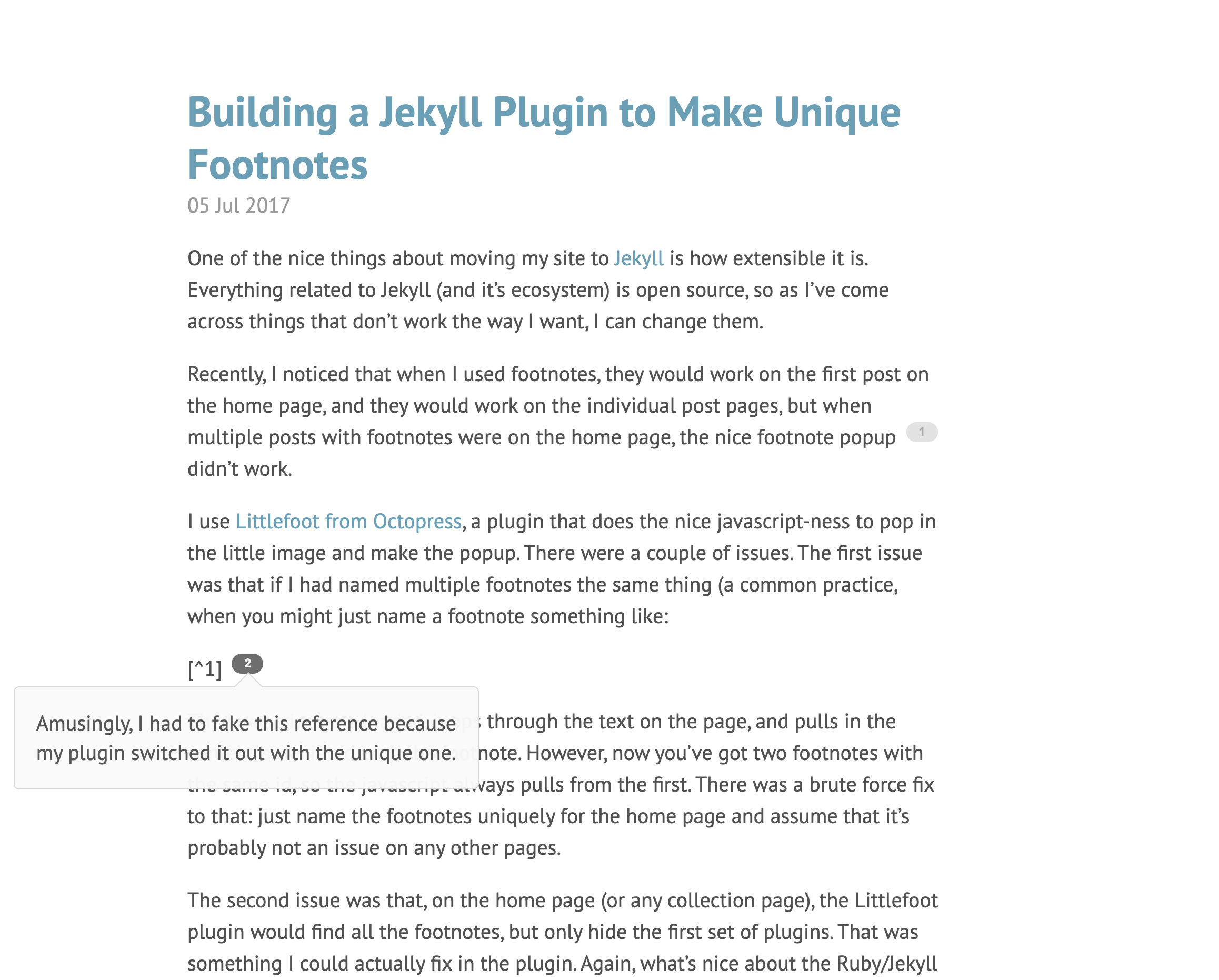
One would think that 30 yearsOr more depending on where you start counting from.
from the birth of hypertext that there would be standards in place for footnotes but we are found wanting. We must thus rely on our own ingenuity.
This is by no means a novel problem. Several have paved the way before me — I take inspiration from Dave Liepmann’s Tufte CSS as well as Jake Zimmerman’s Pandoc Tufte CSS. Zimmerman’s pandoc-sidenote does quite a bit of heavy lifting as well. Of course, Liepmann’s implementation is inspired by Edward Tufte’s handout styling; he acknowledges it early on in the post.Tufte seems to be rather influential. I should take a deeper look.
Tufte CSS is also mentioned very early on in Gwern’s analysis of sidenote designs on the web.It inspired me to write this!
Gwern takes a very thorough look at several implementations concludes that Tufte CSS would suffice for most writers on the web. He does mention of a pure HTML-CSS solution by Said AchmizSaid created sidenotes.js for use on Gwern’s website, in case you didn’t read his essay. Apart from that, it’s been difficult to find this person online. He does have a GitHub profile but it’s very barebones.
but I failed to come across it.If you know, tell me!
Meanwhile, we shall take a look at how I arrived at this design as well as the lesser known implementations across the web that have been glossed over.
My JourneyIf you’d rather not hear about my struggles, feel free to skip ahead.
I initially started out by looking for JavaScript pop-up implementations that would work with Jekyll. I came across several nice implementations which I’ve examined later in this piece. I first came across Ryan Toohil’s implementation. I thought that integrating a Jekyll extension into GitHub pages would be straightforward. It was not so.
I tried installing Jekyll to test out the extension locally if I could but I ran into problems with Ruby. It turned out that installing Ruby was not as simple as I had thought.I actually did figure this out much later.
The Ruby library installed locally caused version mismatches with the one I tried installing using homebrew. Additionally, it didn’t appear to be natively supported on Apple Silicon either. I’d mistakenly thought at the time that I’d have to use a workaround which was more effort than I was willing to expend. This brought an end to my journey of locally building and pushing files.
This time, I read Gwern’s essay more carefully. At the very beginning, he had recommended Tufte CSS as a decent CSS-only solution which would work for most users. I took a look and I was very pleasantly surprised. The entire website’s visual style and choice of font was exquisite.Tufte had a hand in designing the font himself. It is named ET-Book and has a very interesting overslant that I asked about.
I immediately set out to try and adapt it to my needs. I looked up how to change CSS for GitHub pages and it was relatively straightforward.A far cry from being stuck in a supposed Ruby dependency hell.
After testing it out for a while, I realized that I would need to adapt it to my pandoc based workflow. I chose pandoc simply because it’d parse my inline footnotes. Much to my surprise, this wasn’t a widely supported extension to the spec.The syntax makes a lot of sense semantically. It’s a side-thought but isn’t necessarily relevant to the main body of text. I should like to see this gain broader support.
As an example:
This is sample text.^[This is a sidenote.].
This would be a problem since I’d have to manually change the CSS classes and I had no idea where to begin. I sought to do the reverse instead — adapt my pandoc parsed output to the CSS. I set out by reading about pandoc’s features and how it parsed text. I understood that I would have to modify the parsed intermediate formThe AST (Abstract Syntax Tree), to be precise.
and that could be done through filters. There were a number of useful helper libraries and I came across an impressive one in Python. However, just as I was about to start reading the docs, I thought to myself, “Surely, someone has done what I’m trying to do”, and I was indeed correct.It’s a good habit to have.
Enter Jake Zimmerman’s pandoc-tufte-css.It uses his own pandoc-sidenote as a dependency.
It was a blessing beyond belief. I was saved from torturous hours of experimentation simply because we stand on the shoulders of giants. I happily toiled away at my writing after resting assured that my Obsidian notes would easily be converted to HTML. I was quite pleased with the output save for one small exception — blockquotes within footnotes were removed by the filter. This proved somewhat troublesome as I wished to, at times, quote directly from a different source inside a sidenote.The issue was actually opened by Gwern himself back in 2016! I’ve been working on a hacky fix meanwhile.
Although this serves my purpose so far, there are certain problems to consider. It had a noticeable annoyance that I discovered after a bit of testing; the line heights were occasionally incorrect.The semi-colon is actually the correct choice of punctutation here.
This was apparently caused by the sidenote numbers. Long story short, I helped figure out a fix which then made it into the repository after review.I am amazed that I noticed this at all. My pull request, however, was not as amazing and Dave suggested a saner CSS solution.
With line height issues and block quote support out of the way, there are other ones to consider. One would be the lack of block quote support that I mentioned earlier. Lengthy sidenotes may require the user to scroll back up to the initial position, a problem amplified on mobile viewports. This degrades the flow of reading and introduces some cognitive load but one may argue that a lengthy sidenote would do that anyway. There is the problem of saving articles to read-it-later servicesI doubt I shall ever be graced with this honor but it is worth considering for the sake of completeness.
like PocketIt was originally called Read It Later when it launched in 2007. It rebranded itself in 2012. See: Houston, Thomas. “Pocket Review: Read It Later Reinvents Itself.” The Verge, 17 Apr. 2012.
and Instapaper or displaying it in RSS feed aggregators like FeedlyI personally use this one alongside Pocket.
that Gwern mentioned. Finally, there is the “fat finger problem” on mobile devices — a person with a fat enough finger may accidentally trigger a linked article or reference instead of expanding or collapsing the sidenote.I speak from experience. I do actually test my own website.
As is often the case, it is better to cross the bridge when we come to it so we shall delve into this some other time.
Review of sidenote styles
Ryan Toohil
Ryan seems to have a simple Javascript pop-up which I gravitated towards at first. It’s a nice, simple way of keeping the main body clean while retaining the ability to provide more information when necessary. Of course, as Dave noted, it decreases reading efficiency on desktops since we can use a large viewport width to display information in a sidebar. Nonetheless, for text only footnotes, I believe that this is a good starting point, especially if one prefers interactivity and dislikes Tufte CSS for whatever reason. He maintains this as a fork of Octopress’s littlefoot.
Hugo Footnotes Popup
Vojtech Pavlovsky’s Hugo Footnotes Popup is quite admirable. It works seamlessly with Hugo, and in turn Markdown-based websites. It’s also quite pleasant to look at and can be quickly styled with a few CSS tweaks. It looks quite good on mobile and I wouldn’t mind using a style that reminds me of Wikipedia.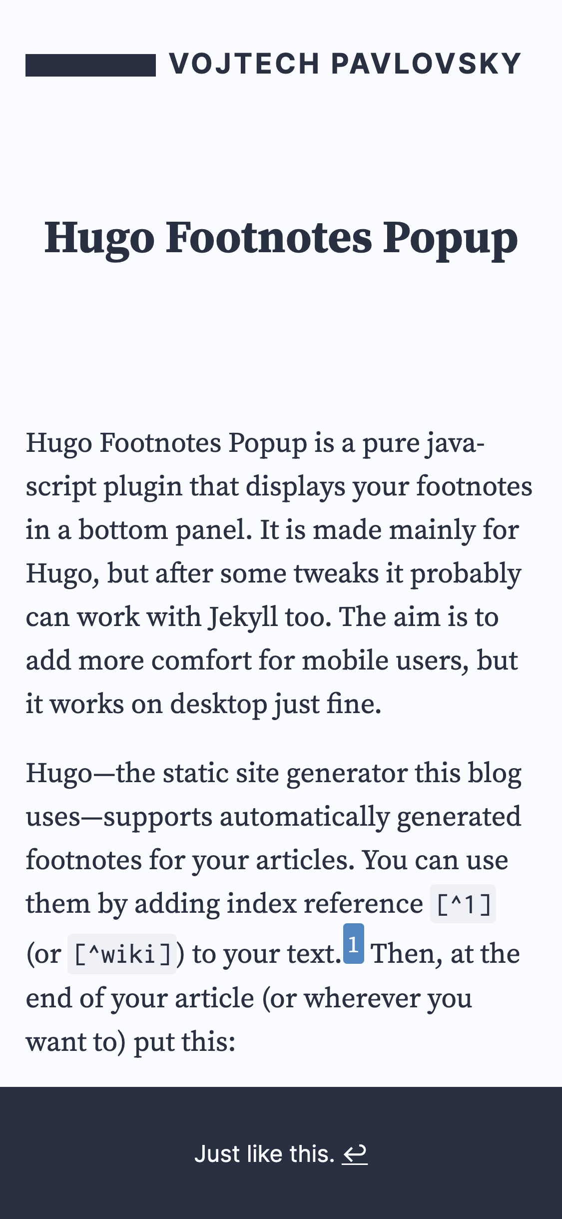 Do take note of the beautiful color highlight on the note number.
One downside is the same as mentioned earlier – it introduces effort on the part of the reader while underutilizing the glorious real estate of a traditional computer screen.

Perhaps a more egregious problem would be that it shifts the article position if a user uses the return button (↩︎) instead of scrolling the viewport. This is not an easily remediable problem as it is baked into Markdown’s footnote design and isn’t necessarily the author’s fault. Interestingly, the footnote simply disappears if the user scrolls instead of hitting the return button. Thus, we can omit the button altogether but it incurs the cost of decreasing the intuitiveness of the interface. Overall, this is a very good idea for a mobile-first website.
Popup Footnotes
Jason A. Heppler wrote in 2012 that he started using footnotes after discovering another person’s post about it. He’s put the code up for others to use but, being a languid fellow, I didn’t test it out and looked around for examples on his blog. I couldn’t find any, much to my annoyance, and I suppose I’ll have to come back to this some other time.Later equals never or Leblanc’s Law for those who have read Robert Martin’s Clean Code.
He does note the benefit in readability that is gained from an inline footnote.
Dr. Drang’s jQuery footnotes
Dr. Drang, inspired by Lukas Mathis’s blog, took to implementing a jQuery script styled to look appropriate for the blog. It looks quite pleasant, especially the light green background which complements the website’s theme, and has the best transition animation by far. While one of the better implementations on a desktop screen, the footnote marker, a ‘❄’ in this instanceAh, the joys of Unicode.
, is barely noticeable on a mobile screen.What is this, a logo for ants?
To his credit, his style has evolved. He implemented a different style in 2010 and modified it in 2013. The style you see now is the one from 2013 onwards, a modified version of Bigfoot footnotes. I may have to do a little tinkering to get a look at the older version.
Lukas Mathis’s jQuery footnotes
This is quite similar to Dr. Drang’s style above. Unfortunately, it appears to be broken as I could not get it to work on modern browsers even with extensions disabled. In his post, he notes how, on desktop, it defaults to showing footnotes on hover while falling back to linked notes on mobile screens. This was a reasonable idea for 2010. We certainly expect to do better in the modern day.
Fortunately, in his updates, he notes that the Feynman Lectures website has adopted his jQuery script. The result is quite remarkable overall but with a few downsides. The popup does not work properly on mobile as most modern mobile browsers now support the hover class. Instead of being taken to the footnote like in the original design, the popup appears in a poorly aligned manner. It is off-center and exceeds viewport width requiring a mobile user to scroll sideways — a no-no in my book.You could say my book sucks and that’d be fair.
Strangely enough, they are properly aligned when using a desktop user agent with a mobile-like viewport width. More thorough testing is certainly called for.
ET-Jekyll Theme
With increased font sizes and line heights, Bradley Taunt’s ET-Jekyll Theme presents a more readable approach to text. This can work well for content focused around text with images being few and far between.
One place where it deviates is in collapsible sidesnotes on mobile screens. Bradley opts to neatly add the content below the parent. He argues that interactive notes are vexatious and that he’d rather pre-define a layout than ask for the user to fiddle with their display — an assertion that has some merit to it.
Athena
The Python based static blog generator opts to change the sidenote color to red and number the notes in a list-like fashion rather than using superscripts. It is an interesting choice but keeps in line with the design of the blog. One noticeable quirk is that the opening line of a sidenote does not align with text on the same row. This is somewhat distracting visually. Another interesting issue is how text seems to abruptly fade off from the right edge of the text box. A visual representation should convey the problem.

Finally, it chooses to render the bibliography at the bottom in contrast to using sidenotes. It seems like a natural extension of sidenote usage and I suspect technical difficulties may have gotten in the way of implementing it.
Tufte Pandoc CSS
Jake Zimmerman’s Tufte Pandoc CSS is an excellent version of the original. It adds syntax highlighting, MathJax support, improved table support, and so on. It avoids the mismatched line heights by setting the sidenote-number class to display inline. The widths are also quite pleasing on mobile.
Jason Peacock’s website uses Jake Zimmerman’s project as a base.The linked post is also an excellent resource for someone with a programming background to get started with a blog written in pandoc.
Being from an older fork of Tufte CSS, it unfortunately runs into the mismatched line heights problem. Overall, however, the few tweaks seem to work out in its favor.
Harvard Law Review
Curiously, the website chooses to go with a narrow column of text with sidenotes on both sides. While aesthetically pleasing, it does introduce difficulty in that a reader will have to glance from side to side to find the correct note.This was noted by Gwern in his original analysis.
It leaves much to be desired on mobile. Occasionally, the notes are misaligned and blend in with the text.Oddly enough, this doesn’t seem to happen if you only decrease the viewport width and instead appears exclusively on mobile user agents, both Android and iOS.
They also don’t appear to retain the same label position upon expanding and collapsing, likely because of the rotation animation, which is visually distracting. To their credit, they do have a smooth fading-in animation but again, they seem to simply collapse out of view instead of smoothly transitioning out. Certainly not what I would prefer given the numerous alternatives.
Wikipedia
It is hard — if not utterly impossible — for one to not be familiar with Wikipedia’s style by now. It shows us a nice little pop-up if we hover over it and also takes us to the appropriate note at the bottom if we click on it on desktop user agents. The same visual pop-up is used to give a visual preview of a different Wiki page, an idea that surely served as inspiration for sidenotes.js. Consistent designs are always a wonderful thing.Like tiggers.
On mobile, it settles on showing us a nice pop-up at the bottom of the screen that serves us the information we need. It is quite an adept way of letting a reader immediately take note of the work references and also read through any notes that may be present. A notable downside, perhaps specific to just myself, is that it is difficult to hit the close button. It can also be said that the pop-up takes us away from the context required for the footnoteSee: Dorn, Brandon. “Of Note: Better Text Annotations for the Web.” Viget Labs, 18 July 2018.
but this isn’t a thorny problem given that Wikipedia’s notes are primarily citations.
FiveThirtyEight
The statistical analysis-focused website has an interesting way of doing footnotes. Footnotes are spans that are displayed inline based on the hyperlink status of the sidenote number. It uses a bit of JavaScript to toggle the class of the footnote, followed by an inline block in Decima Mono. Overall, the result is quite good as Brandon Dorn describes. Considering the website’s layout and the consistency of the mobile and desktop versions of the site, this is certainly one of the better implementations.

Conclusion
FiveThirtyEight’s design is particularly enjoyable because of how well it works on screens of any size. Even Tufte CSS has to poke around with CSS media queries in order to achieve portability between different viewport widths. Nate’sNate Silver, the editor-in-chief at FiveThirtyEight.
style is readable, distinct, familiar across different screen sizes, yet also retains the ability to put information out of the way should the author deem it tangential to the body of the text. However, this comes at the cost of using a sliver of JavaScript. Perhaps a tiny bit of JavaScript is a trivial trade-off for gaining a more interactive way of speaking to a reader. It’s also quite a hassle to keep expanding sidenotes interactively, especially if they’re used indiscriminately.I can only blame myself here. My sidenotes aren’t even informative (yet).
I should like to find more interesting footnote designs across the web so if you ever find one worthy of mention in your journeys, I’m always an email away.